
Reymond's Sketchbook
Reymond's Sketchbook
Reymond's Sketchbook

Grade 10 Visual Art
Grade 10 Visual Art
Grade 10 Urban Art
Grade 10 Urban Art
Grade 10 Urban Art
Creative Process

For this project we had to try and create the worst piece of art we could. The way I chose to approach this project is by packing as much dark and muddy colours as I could into an abstract form. The end result did not turn out as ugly as intended. This project was inspired by famous abstract artists such as Jackson Pollock. The purpose of this project was to understand that the value and appreciation of art can be arbitrarily assigned and that no piece of art is truly 'bad'.

In this project we cut out photographs from several art history textbooks and drew moustaches on them. This project was inspired by Marcel Duchamp's L.H.O.O.Q, in which he drew a moustache on the Mona Lisa. Finding good pictures for this for this project was a bit difficult as the textbooks already had multiple pages torn out, since this project had been done before with previous classes.
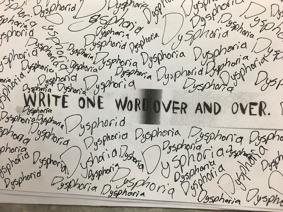
In this project we took select pages from Keri Smith's book "Wreck This Journal" and followed the instructions. This project was, of course, inspired by Keri Smith and her books. I chose to make my journal more monochromatic because i felt that it would look nice against the black and grey printed pages. Almost as if I took something that meant to be fun and light-hearted and twisted it to make it depressing.
For this project we had to try and create the worst piece of art we could. The way I chose to approach this project is by packing as much dark and muddy colours as I could into an abstract form. The end result did not turn out as ugly as intended. This project was inspired by famous abstract artists such as Jackson Pollock. The purpose of this project was to understand that the value and appreciation of art can be arbitrarily assigned and that no piece of art is truly 'bad'.
In conclusion, the project I enjoyed the most was the celebrity colouring page because I find myself usually struggling with human proportion and a find it fun to challenge myself by creating portraits in new ways. I also identify with Phil Hansen the most because I do tend to work in extreme detail which tends to put a lot of strain on my hands and shoulders, so I try to look for less strenuous alternatives. I also find it easier to create a piece when I am given a set of guideline rather than being drowned by creative freedom.
Black Book
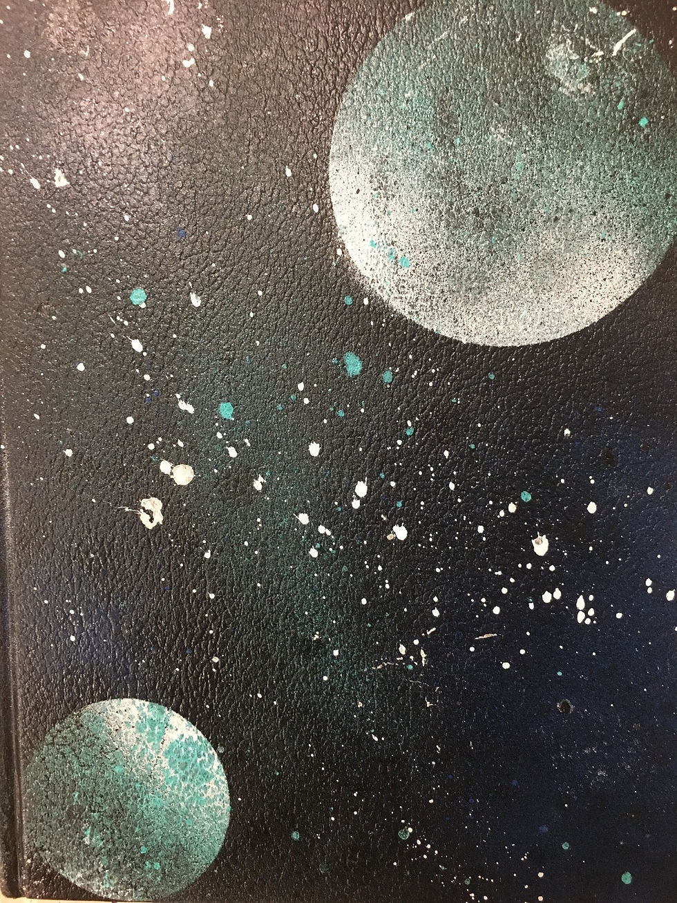
I really like galaxy aesthetics, so I tried to make my black book look galaxy in design. I used techniques I saw street artists use online, however this was my first time using spray paint so the finished product was not exactly what I wanted, but I'm still pleased with it none-the-less.

This was one of the first black book battles we did, in which we had to come up with a crew name and do a piece of graffiti based on it. The group name we settled on was quadruple stuffed oreo. I was very untested in the realm of graffiti at the time, so I opted for a bubble letter design.

We had to try to create a piece using the initials of our school at the beginning of our graffiti unit to test our skills.
I really like galaxy aesthetics, so I tried to make my black book look galaxy in design. I used techniques I saw street artists use online, however this was my first time using spray paint so the finished product was not exactly what I wanted, but I'm still pleased with it none-the-less.
Wheat Paste Project


For this project we had to create a design that could be wheat pasted onto form boards for a gallery showing at the Robert McLaughlin Gallery. For my piece I used cut outs from a fashion magazine along with wheat paste, and a spray paint stencil. I used the spray paint stencil so much in a short period of time that there was a build up and it became quite heavy and difficult to use. During this project I was having an artist's block and couldn't come up with any ideas that really spoke to me so I simply kept flipping through magazine images to see if anything would jump out. The best idea that came to me was this take on how fashion magazines dehumanize the women they portray as nothing more than figures of beauty. I reflected this by blacking out the eyes of the models to show how their true souls are not being portrayed. This project was overall really enjoyable and I'm satisfied with the results.
Tattoo Unit


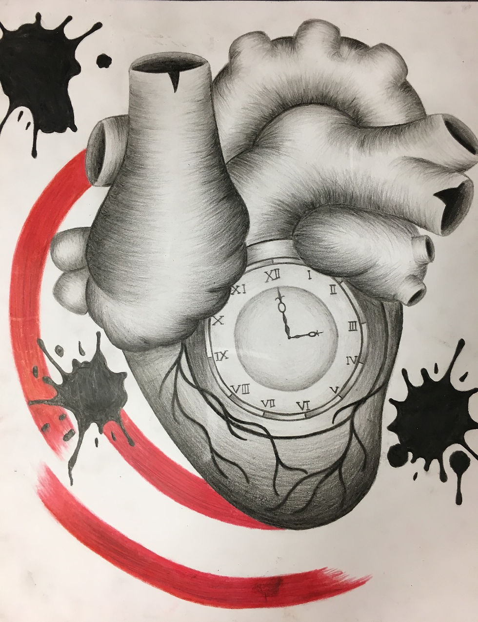
For this project we had to create a tattoo design. I used pencil crayon for the rough and final copy. There wasn't many difficulties I encountered while making this piece, the only thing is the amount of time it took to shade. I chose a trash polka aesthetic for my tattoo because I like the style. If I were to redraw it, I would spend more time refining the shape of the heart
Graffiti Unit
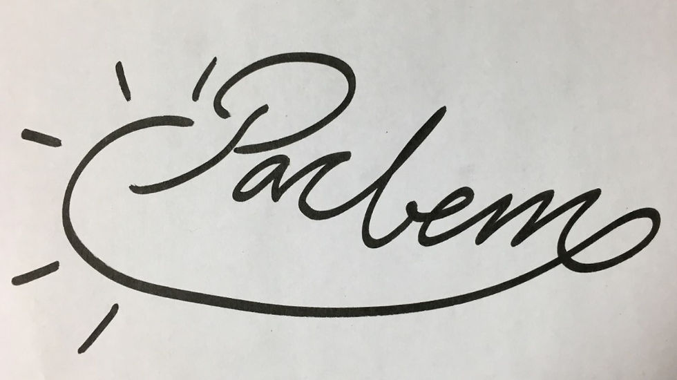


For this project we had to come up with a tag name and create the four major components of graffiti. I mostly used Sharpies because they're very useful. All my graffiti pieces have sunrise elements because my tag name "Pacbet" is a shortened version of "Paccbet" which translates to sunrise which has great symbolic meaning for me. I used the common colours of red and orange with a black border to simulate a a sunrise over a strong silhouette. Overall, I am very satisfied with these pieces.
T-Shirts
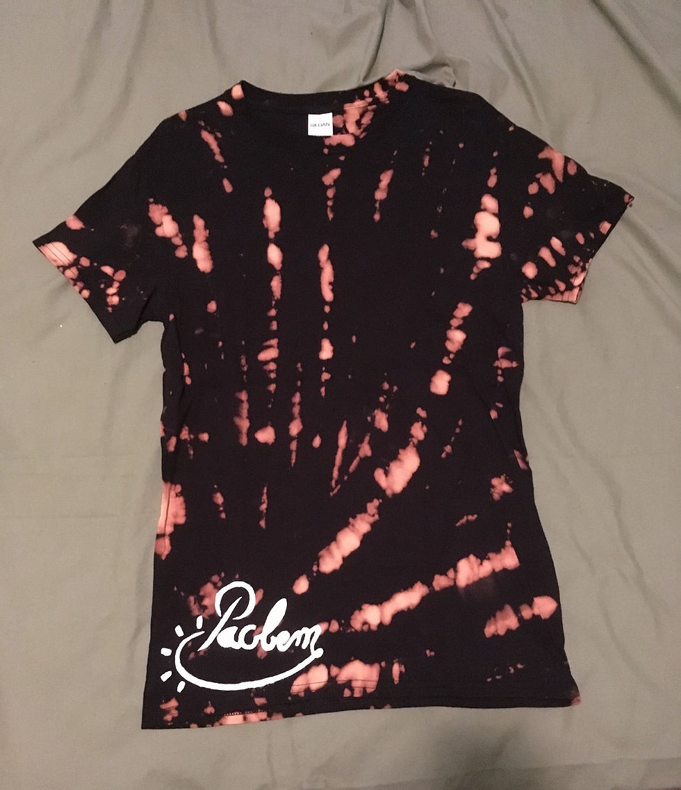

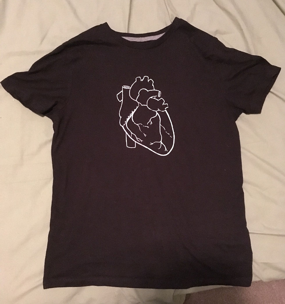
For this project we had to create a t-shirt design and print it on a shirt using fabric ink. The first shirt is tie-died with bleach. I created a screen for my heart graphic so I could print it on multiple shirts. The only challenge to starting to sell these as products is finding a reasonable price for comfortable blank shirts and printing ink. I am very happy with the shirts I made and I wear them all the time.
Skateboard
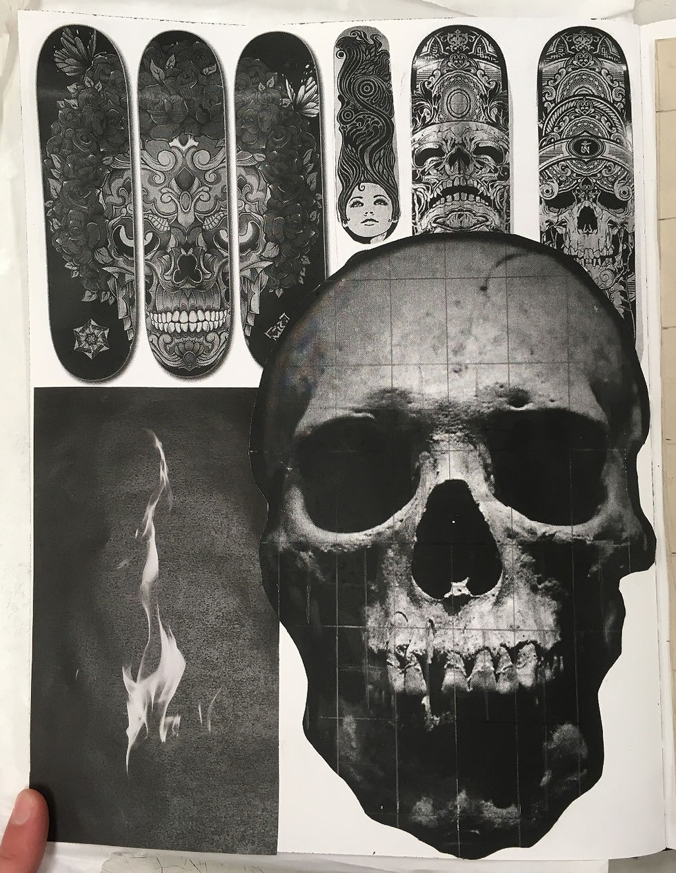


For this project we had to design a skateboard. My original concept was to have a flaming skull, all done with graphite, however after i finished the rough outline for the skull I realized that 3 of the skulls would fit onto the board, so I changed the concept to 'see no evil, hear no evil, speak no evil'. The process of intensely shading the whole board left my arm rather sore, however I believe the finished product was worth the pain. The combination of shaded elements mixed with heavy red line emulates the trash polka aesthetic I used in my tattoo design, this time with skulls rather than a heart. Overall, I believe this project was was lengthy and exhausting, but completely worth it.